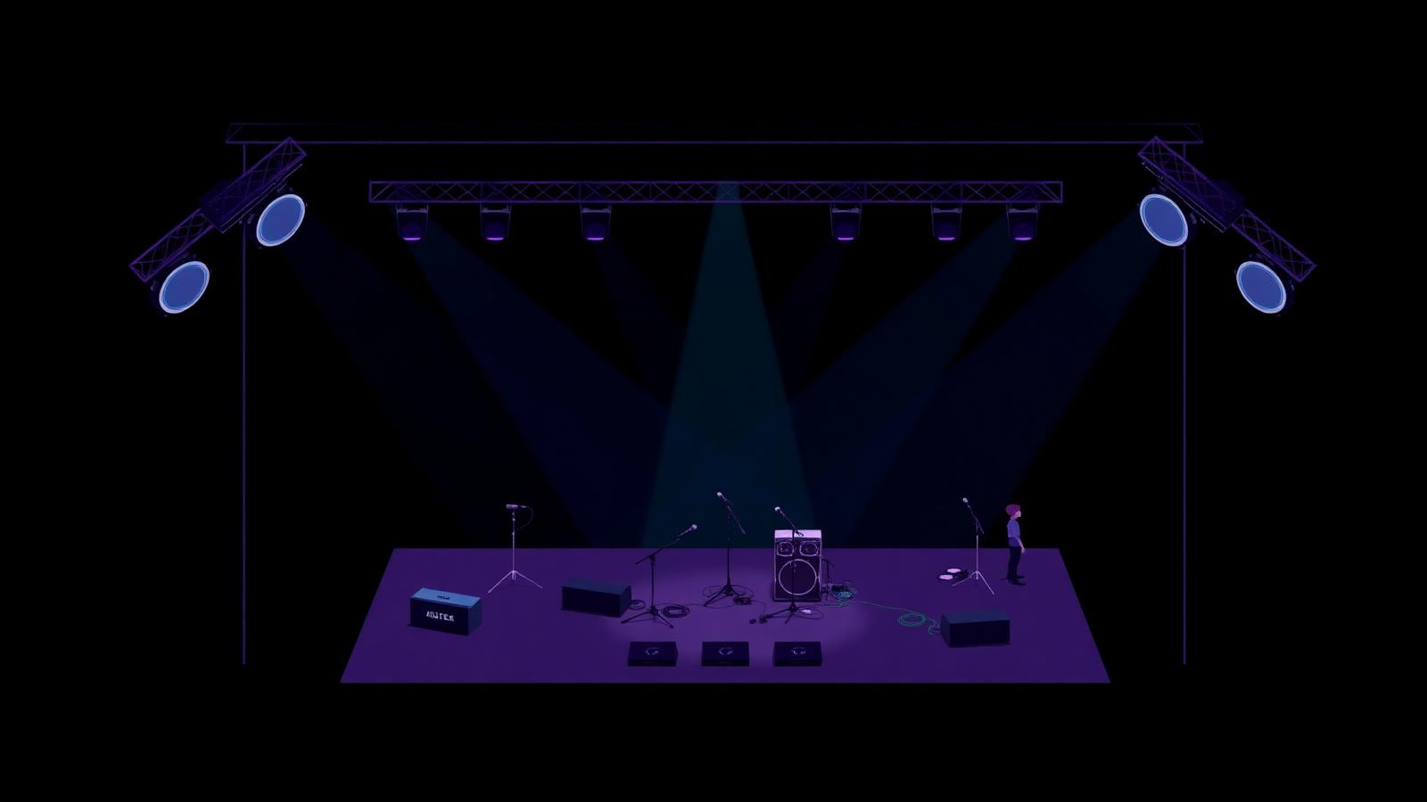
Why bad stage plots create such big problems
Every experienced sound engineer has seen the same document a thousand times: a stage plot with just enough information to look like it is complete, but not enough to actually run the show from. The band arrives. The engineer squints at the page. Questions start. The soundcheck clock ticks.
Bad stage plots are not usually the result of laziness. They are the result of not knowing what makes a plot useful in the first place. Most of the mistakes below repeat themselves week after week, tour after tour, festival after festival — and every one of them is avoidable.
This is what actually goes wrong, and how professional artists and production teams get it right.
1. Missing stage dimensions
Why it causes problems. A plot with no dimensions is a plot the venue cannot use. Every stage is different — a 5×3 metre club stage and a 12×8 metre theatre stage are the same document, but they demand completely different layouts. Without dimensions, the crew has to guess how your show scales to their space.
How professionals solve it. Include the assumed stage size on the plot itself. State clearly: "Drawn for a 8×6 metre stage. Please contact for smaller layouts." That tells the venue two things — what you designed for, and that you are willing to adapt.
Best practice. Always show a scale reference on the plot. Even a simple "1m" arrow in one corner makes the drawing usable at any stage size.
2. No monitor positions
Why it causes problems. Monitors are one of the top three reasons soundchecks run long. When the plot does not indicate where wedges go, the monitor tech has to guess. They will guess wrong for at least one performer, and that performer will spend the first ten minutes of soundcheck asking for their wedge to be moved.
How professionals solve it. Every performer position on the plot has a wedge symbol next to it, pointing in the direction the performer faces. If someone uses in-ears instead of a wedge, that is stated. If a performer needs two wedges — a side-fill and a personal wedge — both are shown.
Best practice. Number the wedges (M1, M2, M3…) and match those numbers to a monitor mix column on the input list. Now the monitor engineer knows exactly what goes where without asking.
3. No input list reference
Why it causes problems. A stage plot without an input list is half a document. The plot shows where the singer stands, but not what microphone they need. The engineer has to invent an input list on the fly during line-check.
How professionals solve it. The stage plot and input list are always sent together, and they refer to each other. Every microphone symbol on the plot corresponds to a numbered channel on the input list. Every DI on the plot has a channel number.
Best practice. Treat plot and input list as one document, not two. If one changes, the other changes with it, on the same version.
4. Missing power requirements
Why it causes problems. A five-piece band with three keyboard players and two in-ear systems needs a lot more power drops than the stage default. If that is not on the plot, the venue finds out about it at load-in, and someone has to run extension cords over live cable paths.
How professionals solve it. Every power drop is marked on the plot with a clear symbol, and the number of outlets needed at each drop is written next to it. Special power (16A, 32A, three-phase) is explicitly called out, not assumed.
Best practice. List total power needs at the bottom of the plot ("Total: 6× standard drops, 1× dedicated for keyboards"). This lets the venue verify feasibility before the show, not during it.
5. No microphone positions
Why it causes problems. Placing a vocal mic in front of a performer seems obvious, until the performer is a drummer with three toms, a hi-hat and a kick, and the plot does not show which of those need mics. The engineer either over-mics — wasting channels and time — or under-mics and gets caught during the first song.
How professionals solve it. Every microphone is drawn on the plot, in the correct position, with a channel number. Overhead mics are shown as clearly overhead. Amp mics are drawn at the amp, not floating.
Best practice. Use a legend on the plot that shows what each symbol means — mic, DI, wedge, in-ear pack, power, laptop. The legend is the difference between a plot the crew can read at a glance and one they have to decode.
6. Unclear instrument labels
Why it causes problems. A rectangle on a page could be a keyboard, an amp, a monitor, a laptop stand or a mixer. If the plot does not label its shapes, the crew has to ask what each block is — for every performer, on every show.
How professionals solve it. Every element on the plot is labelled: "Keys 1 — Nord Stage 3", "Guitar amp — Fender Twin", "Laptop — Ableton". Even if the exact model changes, the type is clear.
Best practice. Where possible, name the performer at each position too ("Anna — vocals, guitar"). This lets the crew match the plot to the people walking on stage in seconds.
7. Using outdated PDFs
Why it causes problems. The band updated the plot last year when they added a bassist. Then a keyboard player joined. Then the drummer changed kits. But the PDF that gets sent to venues is still the one from two years ago. The crew prepares for a lineup that no longer exists.
How professionals solve it. Version every plot with a date at the bottom of the page. Anything older than the last significant change gets replaced everywhere it lives — website, tour manager's folder, festival production packet.
Best practice. Move to a live document that updates in one place. Static PDFs go stale the moment they are exported. A live plot cannot.
8. Inconsistent symbols
Why it causes problems. One plot uses a circle for vocal mics. The next plot uses a triangle. The one after that uses a small M inside a square. Every engineer has to relearn the artist's private symbol language, and mistakes multiply.
How professionals solve it. Use the industry conventions everyone already knows — filled dots for wedges, standard mic symbols, standard DI symbols. If you invent a symbol, define it in the legend.
Best practice. Consistency matters more than creativity. A plot is not the place to show off design skill. It is the place to communicate as clearly as possible to someone who has thirty seconds to read it.
9. Forgetting wireless equipment
Why it causes problems. In-ear systems, wireless guitars, wireless mics — none of them show up on a plot that only draws physical positions. When the venue has RF conflicts with their own wireless gear, they need to know what frequencies the artist is running before doors open, not during the show.
How professionals solve it. Wireless equipment is listed alongside the plot — how many in-ear packs, how many wireless mics, how many wireless instrument systems, and (where possible) which frequency ranges.
Best practice. If the artist is travelling internationally, the frequency ranges matter even more. What is legal in one country is illegal in another. Listing this on the plot triggers the right conversation early.
10. Sending multiple conflicting versions
Why it causes problems. The tour manager sends one version to the festival. The band's manager sends another to the venue. The artist sends a third to their agent's mailing list. Three PDFs are floating around, and no one is sure which one is current. On show day, the venue is set up to the wrong one.
How professionals solve it. One canonical version. One link. One source of truth. Everyone — venue, promoter, festival, agent — reads the same document. Updates propagate automatically.
Best practice. This is the mistake that a live document solves better than any process. When there is only one plot, there cannot be conflicting versions.
The checklist: what every stage plot should include
Before sending a plot to any venue, festival or engineer, check that it contains:
- Stage dimensions and scale — with an explicit reference to the size the plot is drawn for
- All performer positions — clearly labelled with names and roles
- Every microphone — in the correct position, with a channel number
- Every DI — in the correct position, with a channel number
- Every monitor wedge — labelled M1, M2, M3… with facing direction
- In-ear systems — where they are used, and by whom
- All backline — labelled clearly (amp, keyboard, laptop, sampler)
- Power drops — with number of outlets and any special power requirements
- Wireless equipment — count and frequency ranges
- A legend — explaining every symbol used
- A date and version number — at the bottom of the page
- Contact information — for questions
If any of those are missing, the plot is not finished.
Where good stage plots come from
The plots that never cause problems have one thing in common: they are made in a system built for the job, not a general drawing tool. When the plot lives alongside the input list, the technical rider and the day sheet, mistakes get harder to make — the tool nudges the artist toward completeness.
This is what tools like ArtistRider are for. A stage plot in ArtistRider is one part of a complete, connected technical package. Change the input list, and the plot's channel numbers stay in sync. Update the wedge count, and every venue reading the document sees the change. Version conflicts disappear because there is only ever one version.
The result is not a prettier plot. It is a plot that does not fail — because the mistakes above are engineered out by the workflow itself.
Final word
A stage plot is a small document. It is also one of the highest-leverage pieces of preparation an artist can put in. Ten minutes spent fixing the mistakes above will save hours across a tour, prevent avoidable delays at every venue, and make the artist someone that crews look forward to working with.
Bad plots waste time. Good plots make time. That is the whole difference.